Composition
I think of composition as what is inside the frame and how it is organized. That seems a little vague but it addresses what I feel are the big problems I face when taking photographs. First, "what is inside the frame," is a consideration for me because I tend to want to get everything possible into every picture. You know, here's a picture of Jack standing beside the dinosaur and the two of them are standing in front of the parliament buildings over which the Blue Angels are flying in formation to celebrate the eclipse of the sun just visible to the left near the tornado.... There are probably six good pictures there but how often I end up trying to get them all in one frame still amazes me. However, I have learned a little bit about editing and the rule here for me is to decide what the picture is about and then (if possible) get rid of everything that doesn't lead the eye or mind to that subject. When taking photos that usually means zooming in or moving closer or narrowing the depth of field.
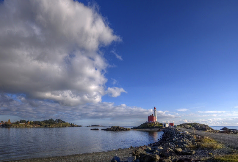
At home, cropping can often solve the problem of too much stuff in the picture. In the Fisgard lighthouse picture below cropping the bottom and the left side removed most of the distracting driftwood and the equally irrelevant Esquimalt Naval dockyard.
The Rule of Thirds has to do with where the subject of the photo is located. Space inside the frame is divided into thirds by two lines drawn across the frame and two lines from top to bottom making 9 boxes. The rule of thirds advises that the most pleasing or interesting compositions are when the subject of the photo is situated where two of these lines intersect. Most of us naturally put our subjects in the center of our photos when we point our cameras. I'm getting better at framing things when I take the photo now and managed to place the lighthouse in this photo almost exactly on the lower right intersection. I've also emphasized in green the leading lines in this photo that pull the eye towards the lighthouse.
There is a great deal more to composition. Above are just a few guidelines I understand and use regularly. Sometimes, as in the photo below, I am very pleased with how it all works.


6 comments:
Somewhere on my puter I have a program called Golden Ratio. It will overlay any window with a semi-transparent grid based on the Golden Ratio, and a spiral produced by these grids. (Interestingly, the Golden Ratio is very close to 1/3).
Many famous historical artists used this Ratio to compose their works.
You can also Google for Golden Ratio images and simply import it as a semi-transparent layer to overlay your base image to see how your composition compares.
I don't get too caught up with it, but it's an interesting exercise.
Speaking of birds...
Some great photos of nesting herons to be had in the north side (Admirals Rd side) of Cuthbert Holmes park.
I counted about 4 dozen or so yesterday. One big tree has been turned into the community 'nursery' with about six nests that I could see.
I now have a new found admiration for the patience of nature photographers...
It is fascinating to understand what makes any image more interesting or engaging than another. It's what our eye does when viewing that lets us know if we like it.
I know I often enjoy a composition where the rectangular borders do not seem to contain the imagery and the subject extends beyond it's format limititations.
A common practise for amateur photographers and artists in general, is to have a specific object tightly centred with a lot of space around them because the subject is the entire focus, versus the greater picture itself.
A recent poster here, Anne McKinnell, has some great shots on her website with really good compositions including close-ups of the texture of flamingo feathers where we know the subject, and the interest is the abstract detail and colour.
Awesome post. I have been told that I have a good eye when it comes to composition. The photos that get a lot of positive feedback are those that have the 'foreground, middle ground, background' thing going on.
I also have a paper cutter at home that I use to crop the hard copy of my photos for my albums, and of course the crop feature on the laptop computer comes in handy for the virtual pics.
It seems so easy to make a good picture of the way you explain it. Thank you for the explanation.
Post a Comment