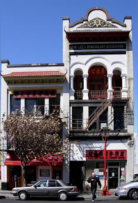
 This is one of my favorite buildings on Fisgard Street in Victoria's Chinatown. Above is what it looks like to me. Below left is what it photographs like. When I "improve" the perspective of the building however, the man and the cars begin to look squashed as you can see in the side by side comparison below. Which do you prefer? Opinions and explanations gratefully received.
Original | Photoshopped |
***For those of you who may be interested in this sort of thing - thanks to Jack's suggestion (see comments) I messed around a little more with this and was able to rectify the squashiness (below). When all's said and done, however, there is a loss of sharpness.


5 comments:
You know, I can't decide. I don't fuss with fixing the lines on mine, and sometimes they are really annoying. But there's something to be said for both of your examples. Someone once pointed out that it's our brains that make the compensation of perception, because we know the building is the same width all the way up. But things do get smaller with distance. So I guess it's finding the line between what the lens distorts, and what is really out there, if you want to play with it.
There's also some lens distortion in there because the line of the building bends outward near the middle.
I think that the type of photo dictates whether to correct the perspective or not. This photo is mainly a photo of the building, so having it bend away at the top is more distracting than the distortion of the man and the car. If the photo had focussed more on the man or some other subject, then the distortion on the building wouldn't need correction.
The straight one (on the right). With Photoshop you can stretch the shot a bit at the top to bring the building and man back to their correct height. You'll lose a little of the sky. Or you could do it from the bottom and lose a little of the street.
Thanks all for your comments and suggestions. I messed about with the photoshopped version a little more according to Jack's suggestion (above) and was able to correct the squashiness. But I notice that each time I distort the original I lose a little precious sharpness and clarity. I guess there's always a trade-off.
If you're losing "precious sharpness" it's more than likely because you're saving the file in a jpeg format and quite possibly at something less than a 12 quality as well.
If you're going to manipulate a photo, do your work on a copy and not the original file. Also, if you're not saving the file as a tif file you're throwing away pixels everytime you open, change anything at all, and re-save.
Post a Comment